|
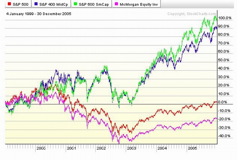
McMorgan Funds ran our Defined Benefit and our Defined Contribution
plans from the mid 90's until late in 2004. The chart below represents the performance of the McMorgan Funds stock portfolio
(MCMEX) and their mixed stock and bond portfolio (MCMBX).
It didn't have to be that way. The McMorgan
Funds equity portfolio tracked the S&P500 index. We could have had a stock portfolio that tracked other indexes
too. In other words, we could have been "DIVERSIFIED". The chart below shows what we could have
had if we had also been invested in funds that tracked the S&P mid and small cap indices during that same period.
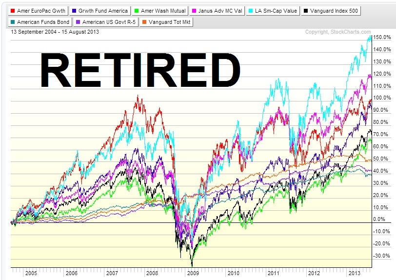
The chart below shows the performance of all the mutual funds now
available to our 401a plan since they replaced the McMorgan Funds mutual funds in late 2004.
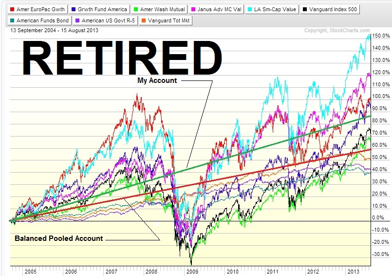
The chart below shows the performance of the Balanced Pooled Fund and my personal defined contribution
plan account against all of the new replacement mutual funds from 9/04 to date.
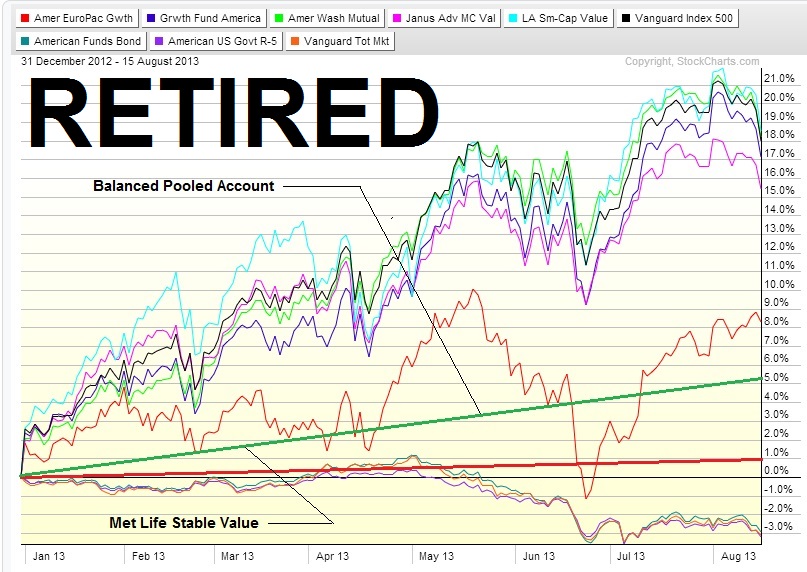
The chart below shows the 1/1/12 to date performance of
the mutual funds that are available to my 401a.
|